Typography is more than just choosing a font; it is the art and technique of arranging type to make written language legible, readable, and visually appealing when displayed. In print design, typography is a critical tool that influences how information is perceived and understood. The right typographic choices can elevate a design, engage readers, and reinforce a brand’s message. At Spencer Printing, we understand that exceptional print projects begin with thoughtful typography.
Why Typography Matters in Print
When readers interact with printed materials—like brochures, business cards, posters, or magazines—their first impression is often shaped by typography. Well-designed typography not only improves comprehension but can also create a positive emotional response in readers. This highlights the importance of considering every aspect of type, from font selection to layout.
Typography in print design is about more than aesthetics. It’s about readability, hierarchy, and ensuring that your message is communicated clearly. Effective typography guides the reader’s eye, establishes a visual flow, and brings harmony to the overall design.
Font Selection: Setting the Tone
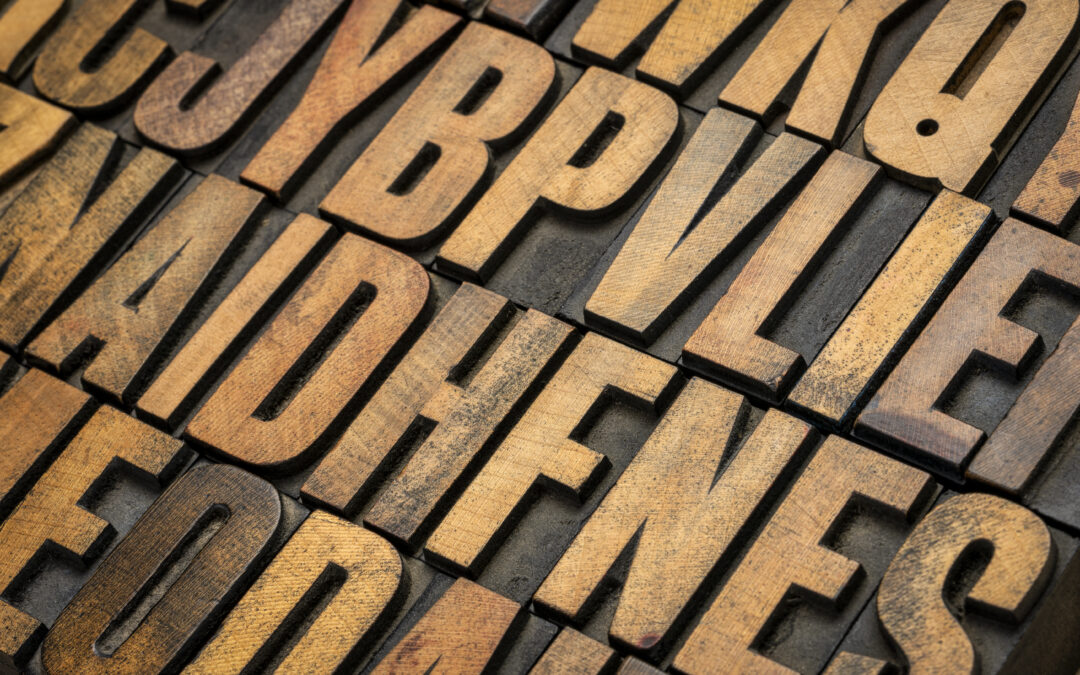
Choosing the right font is the foundation of every successful print design project. Fonts carry personality—serif fonts like Times New Roman or Garamond evoke tradition and reliability, while sans-serif fonts such as Helvetica or Arial are known for their modern, clean appearance. The choice of font should align with the brand’s identity and the message you want to convey.
Consider a high-end restaurant’s menu. Elegant serif fonts might communicate sophistication, while a playful boutique could opt for a hand-lettered script to appear friendly and approachable. The right font can significantly increase reader engagement and comprehension.
Spacing and Readability: The Subtle Art
Beyond font selection, spacing elements such as kerning, leading, and tracking play a pivotal role in print design. Kerning refers to the space between individual characters, leading is the vertical spacing between lines, and tracking adjusts the overall spacing between characters in a block of text. Proper spacing enhances legibility and prevents the text from appearing crowded or disjointed.
Optimal line spacing can improve reading speed and comprehension by allowing the eye to move smoothly from one line to the next. For example, increasing line spacing to 120–145% of the font size is often recommended for body text in print.
Layout and Hierarchy: Guiding the Reader’s Journey
Typography is integral to establishing visual hierarchy, which helps readers navigate your content. By varying font sizes, weights, and styles, designers can guide attention to headlines, subheadings, and key information. For instance, bold headlines draw readers in, while smaller, lighter body text encourages thorough reading.
Effective use of hierarchy also ensures that important information isn’t overlooked. In a flyer or brochure, for example, strategic use of type can direct readers to calls-to-action, contact details, or special offers. A clear typographic hierarchy can increase message retention.
Examples of Effective Typographic Strategies
Let’s look at a few real-world examples where typography plays a starring role in print design:
- Business Cards: Minimalist layouts with ample white space and carefully chosen fonts create a professional and memorable impression. A bold, legible name paired with a subtle company tagline can make a business card stand out.
- Event Posters: Contrasting font sizes and weights can highlight event names and dates while supporting text remains readable but unobtrusive. Using color strategically within type can further draw attention to key details.
- Brochures and Catalogs: Consistent use of type styles for headings, subheadings, and body copy creates a cohesive look and aids navigation. Well-chosen fonts can reinforce the brand’s tone, whether it’s luxury, fun, or innovative.
Want to see how these principles work in action? Explore our print services for more information.
Best Practices for Print Typography
To make the most of typography in your next print project, keep the following best practices in mind:
- Limit Font Choices: Using too many fonts can make a design feel chaotic. Stick to two or three complementary fonts.
- Prioritize Legibility: Ensure body text is easy to read at typical viewing distances. Avoid overly decorative fonts for large blocks of text.
- Use Contrast Wisely: Ensure there’s enough contrast between text and background for maximum readability.
- Align with Brand Identity: Choose typefaces that reflect your brand’s values and personality.
Our experienced team at Spencer Printing is always available to help you make these choices, ensuring your print materials are both effective and on-brand.
The Lasting Impact of Typography
Typography is a powerful tool in print design—one that shapes perceptions, enhances readability, and ultimately determines how your message is received. Whether you’re designing business cards, brochures, or marketing collateral, thoughtful typographic choices will set your brand apart.
Ready to elevate your next print project? Reach out to Spencer Printing to discover how expert typography can bring your vision to life.