
In today’s fast-paced world, a well-designed poster is a powerful tool for grabbing attention and conveying your message quickly and effectively. Whether displayed in a storefront, at a trade show, or on a community bulletin board, posters can turn passersby into customers—if they are crafted with intention and expertise.
At Spencer Printing, we understand that the secret to a successful poster lies in the perfect blend of eye-catching design and clear communication. In this guide, we’ll walk you through the essentials of designing posters that captivate and communicate, focusing on focal point creation, typography hierarchy, and ensuring print quality for large-format displays.
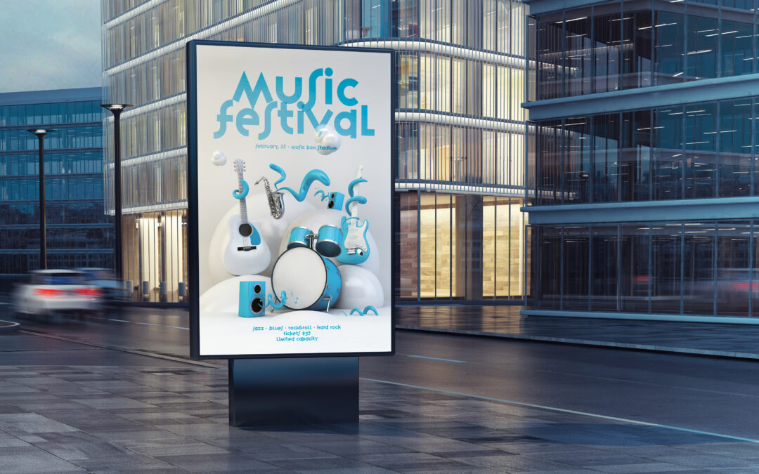
Create a Strong Focal Point
Every memorable poster has a visual anchor—a focal point that immediately draws the viewer’s eye. This element serves as the starting point for their journey through your message. But what makes a strong focal point?
A focal point is typically the most visually dominant element on your poster, whether it’s a bold headline, a striking image, or a unique graphic. People process images much faster than text, making imagery a natural choice for your poster’s focal point. High-resolution photos, colorful illustrations, or dynamic shapes can all serve as compelling anchors.
Contrast is key—use color, size, or placement to separate your focal point from the rest of the content. For example, a vibrant product image set against a muted background will instantly attract attention. Additionally, consider the “rule of thirds,” a fundamental design principle that suggests placing your focal point off-center for a more dynamic and visually interesting composition.
Remember, the focal point should lead the viewer to the next most important element. If your poster’s main goal is to promote an event, ensure the event name or date is prominent and easy to find after the initial impact.
Master Typography Hierarchy
Typography is more than just picking a font—it’s about creating a visual flow that guides your audience through your poster’s information. A well-structured hierarchy ensures that your primary message stands out, while secondary details are still easily accessible.
Begin with your headline. This should be the largest and boldest text on the poster, positioned near your focal point. It needs to be concise and impactful, often no more than a few words. People form judgments about brands within 50 milliseconds, so your choice of font can instantly communicate your business’s personality.
Next, move to your subheadings and body text. Subheadings break up content and make it easier to scan; keep them legible and slightly smaller than your headline. The body text should be clear and straightforward, avoiding overly decorative fonts that hinder readability. For posters, sans-serif fonts like Helvetica or Arial often work best, especially from a distance.
White space is another essential aspect of typography hierarchy. Don’t be afraid to leave areas of your poster blank. Adequate spacing between text elements prevents visual clutter and helps each piece of information stand out.
Ensure Print Quality for Large-Format Displays
A beautifully designed poster can lose its impact if the print quality doesn’t meet expectations. Large-format printing presents unique challenges—images and graphics that look sharp on a computer screen may appear pixelated or blurry when blown up.
Resolution is critical. For posters and other large prints, images should be at least 300 DPI (dots per inch) at the final printed size. Avoid stretching smaller images to fit your design; instead, source high-resolution files or use vector graphics, which can be scaled without loss of quality.
Color management is another important consideration. The colors you see on your monitor may not exactly match the printed result due to differences in color spaces (RGB for screens, CMYK for print). Working with a professional printer ensures accurate color reproduction and vibrant results.
Paper choice also affects the final appearance. Glossy finishes can make colors pop, while matte finishes offer a softer look and reduce glare—ideal for posters displayed under bright lights. Discuss your options with your printer to select a substrate that complements your design and intended use.
Craft a Clear and Compelling Message
Even the most visually stunning poster will fall flat if your message is muddled. Clarity is king. Define your objective before you begin: are you promoting a special offer, announcing an event, or building brand awareness? Every design decision—from the headline to the imagery—should support this goal.
Keep your copy concise. A poster is not the place for lengthy explanations; instead, focus on what matters most. Use action-oriented language to encourage engagement, such as “Visit Today,” “Register Now,” or “Learn More.” Include only essential details: the what, where, when, and how.
Don’t forget your call to action (CTA). This is the step you want the viewer to take after seeing your poster, whether it’s visiting a website, calling a number, or scanning a QR code. The CTA should be easy to find and understand, located near the bottom or in a prominent spot within your design.
Test and Refine: From Screen to Print
Before sending your poster off to print, take time to review and test your design. Print a small-scale version and view it from a distance to ensure all elements are legible and your focal point stands out. Gather feedback from colleagues or clients—fresh eyes can spot issues you may have missed.
Consider how your poster will be displayed. Will it hang in a window, on a wall, or outside? Adjust your design for the environment, taking lighting and viewing distance into account. For example, outdoor posters may require bolder text and higher contrast for visibility in sunlight.
Professional printing services can elevate your poster from good to great. At Spencer Printing, our experts can advise you on file preparation, material selection, and finishing options to ensure your poster looks its best.
Elevate Your Brand With Effective Poster Design
Designing posters that captivate and communicate is both an art and a science. By focusing on a strong focal point, mastering typography hierarchy, ensuring top-notch print quality, and delivering a clear message, you can create posters that not only attract attention but also inspire action.
Ready to bring your vision to life? Contact us today to get started on your next standout display. With the right design and print partner, your message will shine wherever it’s seen.