Choosing the right brochure style seems like a minor decision until you realize it controls the entire reading experience. The way your brochure folds determines how readers discover your message, panel by panel. Some styles build excitement with a big reveal, while others lay everything out for quick scanning.
This blog will help you to understand how to choose the right brochure style for your business.
Understanding the Most Popular Brochure Folds
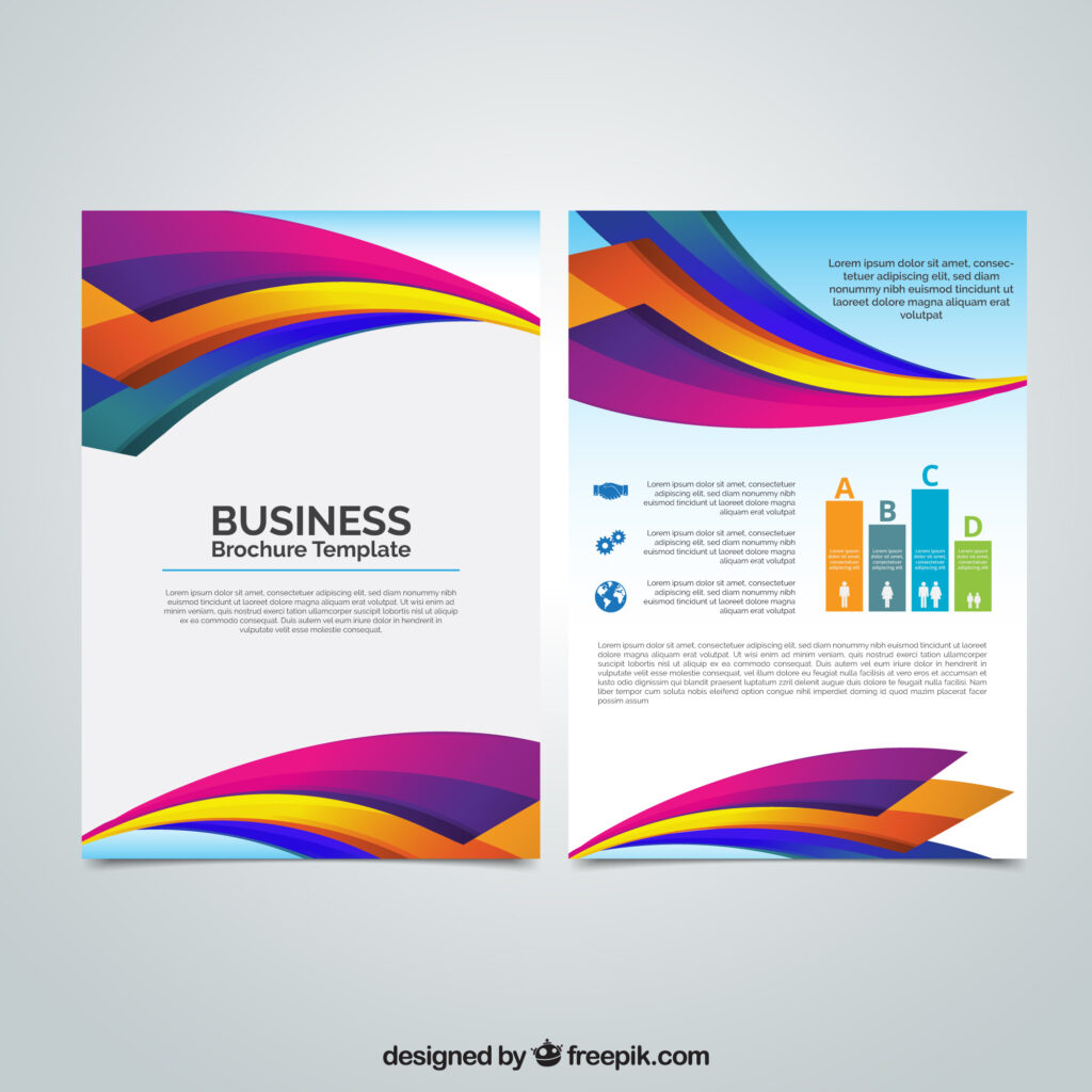
The Tri-Fold Brochure
The tri-fold brochure wins as the most popular style for good reasons. You make it by folding a regular 8.5″ x 11″ paper twice, which creates three panels on the front and three on the back, six panels total. The right side folds in first, then the left side covers it, making a compact little package that fits almost anywhere.
The Z-Fold Brochure
The Z-fold brochure looks a lot like a tri-fold when closed, but watch what happens when someone opens it. Instead of one panel hiding under another, they accordion out in a zigzag pattern. You can actually see why they call it a Z-fold when you look at it from the side.
The Gate-Fold Brochure
A gatefold brochure creates a special moment when readers open it. Picture two doors that swing open from the sides; that’s exactly how this fold works. The outer panels meet in the middle like gates, and when you open them, you see a big center panel that’s twice as wide as the sides.
How to Choose the Right Brochure Style
The first question to ask yourself is how much information you’re actually sharing. If you only have three or four main points, a half-fold brochure gives you enough space without making readers flip through a bunch of panels. When you have more topics to cover, maybe six or seven distinct sections, a tri-fold brochure organizes everything into bite-sized pieces.
How do you want someone to experience your brochure? Gatefolds work beautifully when you’re building toward a big reveal because readers have to actively open those gates to see what’s inside. This creates natural excitement for product launches, special announcements, or exclusive offers that deserve a dramatic presentation.
Different types of businesses naturally gravitate toward certain brochure styles based on how customers actually use them. Restaurants stick with half-folds or tri-folds because these formats make it easy for diners to compare menu items and prices.
Practical Design Tips That Actually Work
Keep your brochure design clean and focused rather than cramming every inch with text and graphics. Cluttered layouts confuse people and hide your most important information under piles of visual noise.
The way readers move through your brochure design matters just as much as what you say. Use clear headings that tell people what each section covers, add numbers if you’re showing steps, and consider arrows or icons to guide eyes where you want them to go.
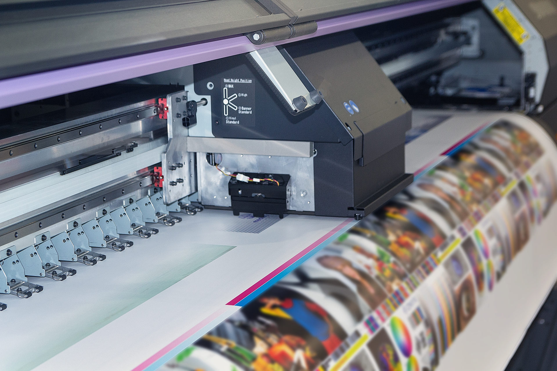
Professional brochure printing makes a bigger difference than most people realize. Home printers produce uneven colors, wonky folds, and flimsy paper that screams “amateur.”
How Spencer Printing Can Help
When you work with Spencer Printing, your brochures show up on schedule looking professionally finished. The combination of knowledgeable staff, reliable equipment, and fair pricing takes the stress out of brochure printing for businesses all across the USA. Whether you’re ordering 50 pieces for a small event or 5,000 for a major campaign, every single brochure gets the same careful attention from start to finish.